Sunday, 6 November 2011

Photographic skills A - Final studio assignment

With my two portraiture photographs done and dusted, I set about decided upon my still life/product shot. I decided I was going to play with the idea of creating a promotional image of some sort. I did some research into different types of photographs we see in advertising. Images such as those seen below:


Having already done two piece of work which involved a model, I decided this time I was going go without a model in this image, that instantly made some photographs, such as fashion and beauty product shots unfeasible.  I've always thought low key lighting  techniques were very effective in advertising campaigns, so felt this would be an ideal route to head down.
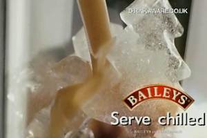
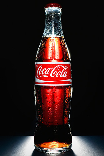
Images such as these seen below, are in my opinion, create an eye catching and atmospheric photograph without detracting from the actual product on show.


Now I knew the lighting techniques I was going to go for, I had to decide what product I was going to shoot. This type of advertising image lends its self very well to producting which contain glass, so my obvious thought was to advertise a drink of some sort.
Here is an extract from my proposal


As the title suggest, my plan is simple, yet potentially a very effective low key photograph.
The drink in question, Disaronno, has a fairly dark brown colour. With an almost handmade feel to the bottle. The dents and raised areas on the bottle create small shadows and highlights.
I plan to light the bottle in such a way that a slight bit of drink is exposed, along with a very small cross section of the bottle. I then plan to exposure the logo, name and tag line in such a way that they are clearly visible and pull the viewer’s eye to them immediately. As the viewer looks at the photograph longer, they then start to see the bottle and its contents.
This will create an air of mystery around the bottle and its contents

I didn't think it would be possible to light different parts of the subject like that while still creating a low key shot, and blending the images into one wouldn't be that much hassle!


When my studio time came, I simply threw a black cloth over a table and used one light with a soft box and began experimenting with the flash light in different places around the product.
Here are some of the unused results, demonstrating how I moved the light around the subject.


As you can see, the photographs were a bit boring.
Yet I expected that, thats why I had plants to take images with light shining on different areas of the subject and blending it into one.


In this image, the light was shining from the top left, onto the neck of the bottle


For this image, I placed the light even higher, yet used a snoot to concentrate the light. This had the effect of making the bottom of the bottle unexposed.


I quickly started to understand how I was going to achieve the final shot.
I finally got 3 images I felt I could create a final image from.


This first image had the right hand side of the lid and neck exposed as I was looking for.


The second photograph had the rest of the neck and the left hand side of the contents exposed as I was aiming for.
The small highlight on the top right hand side of the bottle also proved useful


The final image had the neck, lid logo, lable and the rest of the contents exposed roughly as I was looking for.


 Unconformity, the photographs were not perfect. Luckily I always shoot in raw so was able to fiddle with the contrast and boost the fill light as needed in conversion.

The image below in an explnation of the final photograph. I have colour coded where the different parts of the final image came from. E.g. All the parts of the photograph inside the light blue circles came from image number 3 above.
I hope this give you an insight into how my final image was constructed.


While blending in each photograph, I felt the image still lacked impact. So I increased contrast in the logo on the lid, the lable and reduce highlights in other areas of the image. I finally had an image which I could use.


That done, I felt I should add some sort of writing. After all, its not often you see an advertisement without any sort of information on! I went to the Disaronno website and looked for their tag lines and and catch phrases, it appeared the one currently in use was 'I'm in the mood for...'. I then carefully looked for a font which without being an exact copy, carfully replicated the font they had used.
I added the logo (the coat of arms in the bottom left corner) from one of my own photos, nd then used Disaronnos written logo from their website. I took the decision to add the drink aware logo in, as this is commonly seen on alcohol advertisements these days.
Below is a higher resolution copy of my image.


Saturday, 5 November 2011

Photographic skills A - Final studio assignment(cont)

For my second portraiture shot, I decided I was going to go down the line of creating a full length photograph of my model. I decided I would attempt to recreate the type of images seen on the lookbook website.

Here is a further explanation from my proposal:


In my second piece of studio work, I’ve decided to reproduce a photograph in the style of images often seen on the popular fashion website look book.
These images are technically portraiture; however the model often takes a ‘back seat’ in the frame, while the photograph attempts to give priority to the clothes the model is wearing.
This is achieved by taking a series of photographs, (usually 1 full body shot and a series of close ups) and presenting them side by side, as if they were a single image (see below for better explanation)
These images are often very informal, and almost feel playful. This is a very important part of the image in my opinion, something I will put an emphasis on replicating in my studio. This will be done by making my model as relaxed as possible, handing a high level of control over the shot to her, giving her the freedom to pick how she wishes to pose and act as naturally as possible. This relaxed feeling will also be easily achieved due to the close relationship me and the model have.
I’ve decided to attempt this sort of image as I, and my model are both very keen on this form of fashion photography, and the fashions which are generally popular on look book. I believe this helps both me as the photography, and my model to know exactly what outcome we are attempting to achieve.

My inspirational and reseach images all came from the lookbook website. The images below give an understanding of the sort of outcome I was looking for.


To be honest, I actually had a lot of problems with this photograph and in hindsight it probably wasn't the best of ideas for a studio based shoot. The images were dull and boring, and I just couldn't get the lighting right. It took a good hour and a half of playing about until I finally began to produce images I was more happy with.
I've added all the information on my though process and post production in the images below.


Below is a higher resolution copy of the final image.
So there we have it, my first two portrait shots finally completed. Im pretty happy with the outcomes, granted they could have been better but for a complete newcomer to this sort of photography I feel the results are great!

I just want to say thank you to my model Sophie, for being so helpful and understanding! Cheers Soph :)


Photographic skills A - Final studio assignment

Having never used a studio, or even a flash in my photography, the idea of a studio assignment was a daunting idea.
We were given a brief, to create either 1 portrait photograph and 2 product or still life shots, or 2 portrait photographs and 1 product/still life. Having come from an entirely landscape based style to studio photography, which I previously had no real interest in was bizarre.


My instant reaction was to lean towards the idea of two product shots, as I have an inept ability to photograph peeople. But the more I thought about it, the more I realised I really had nothing to lose! University is about learning, many as well throw my self in at the deep end of the learning curve now instead of shying away from what will inevitably come.

So I decided upon 2 portraiture shots and one product shot. Only problem was, I had no idea about studio lighting.
Half of the group then took part in a lighting workshop with Anne, which was a superb opportunity to learn from an enthusiastic and knowledgeable teacher. I really enjoyed the workshop, and took away new skills and a confidence in studio lighting and what type of lighting I'm going to be using for my photographs.


For my first portraiture shot, I decided to keep it as simple as possible, here is a quote from my Proposal


This being my first ever portrait shot, and the first time using a studio, I’ve decided to keep this first photograph as simple – Yet effective as possible.
            My intention is to take a ‘standard’ head shot, the type of which are often seen in models portfolios.
These images aim to give the perfect balance of showing the subject in the best possible lighting, while producing a clean and natural image.
These photographs are referred to simple as ‘Polaroid’s’ in the modelling industry. Usually the model is require to wear little or more usually no makeup what so ever.
Meaning the correct lighting is an essential part of portraying the model in the most natural yet flattering way.
My model will be wearing make up, yet I still aim to reproduce a natural look.

There are many examples of this type of photograph on the Internet, here are some of the ones I found on google images that interested me the most:


I felt this sort of image would be an ideal outcome, so set about writing up my proposal.

Once my studio time came, I was happy and comfortable in the knowledge that I had a clear objective for the shoot. I set up my lighting as my model got ready and began taking photographs. I was pretty unhappy with the results at first, it just wasn't working the way I needed it too. With a little guidance from John, and plenty of experimentation, I soon got a few shots I was happy with.
Once I got home, I sorted through the photographs and shortlisted the images I was happy with. I started editing the photographs and began going down a different route. I decided I would step away from images as seen above, and attempt to recreate an image similar to this:


There were one or two images I edited, but I just couldn't recreate the style. An attempt of my own to create a smiler image can be seen below.


Neither of these images worked for me though, so I decided to go back to my original idea.I found a better image and began editing it, here is the final result:


Im pretty happy with this final outcome, considering I've never even taken a photograph of a person in anything other than family photographs before. The image below briefly outlines post production.


There we go, first every studio image complete!

Shutter Speed Assignment.

As part of photoskills A, we were asked to demonstrate our understanding of fundamental photography principles.
Part of this was shutter speed. We were given an assignment to take 5 photogaphs using long shutter speeds (below 1/20th of a second). I was luckily going home that weekend, so had the chance to take the camera out back in north Wales!
I felt as if the cliche image of cars leaving light trails would be a bit boring, though it would demonstrate my knowledge. As a result, I decided to look more at long exposures of water. Below are my results, all images had exposure times of over 1 second.


The image above was taken literally in the middle of a slow moving river. I set my tripod up, put on a 6 stop neutral density filter and exposed. 


This image was taken in the same river. The water in this area had just taken a plunge over a man made damn type structure, the water was very calm as it traveled away from the dam, but as a result of the turbulence there were bubbles visible in the water. The streaking effect in the water was caused by the bubbles traveling down stream.


This image was taken from an old life boat station near Beaumaris. The scene was very bright when I took this, so I needed to use both an ND6 and ND10 filter, doubled with an aperture of f/14! Giving me a total aperture value of 30.
The Menai straits doesn't have waves as such, as a result the water wont turn into the milky effect you see on many images without very long exposure times. The above image was taken with an exposure somewhere in the area of 2 minutes. As a result, the water has an impression of movement in it.


This final image was taken again from Beaumaris, yet this time with a far longer exposure time. As a result, the water and sky both became completely 'smoothed out' creating a surreal effect.


Long exposure photography is one of my interest points. I really enjoy the effect of daytime long exposures on landscapes, especially waterscapes.
Below are a few of my favorite long exposure photographs: